Facilitated cross-functional workshops (IA, problem mapping, prioritization)
Benchmarked competitors and analogous products
Translated research into architectural concepts and design principles
Created definition artifacts used by Product & Engineering for strategic planning
Year
2024
About this projects
Turning fragmented knowledge into scalable enterprise architecture
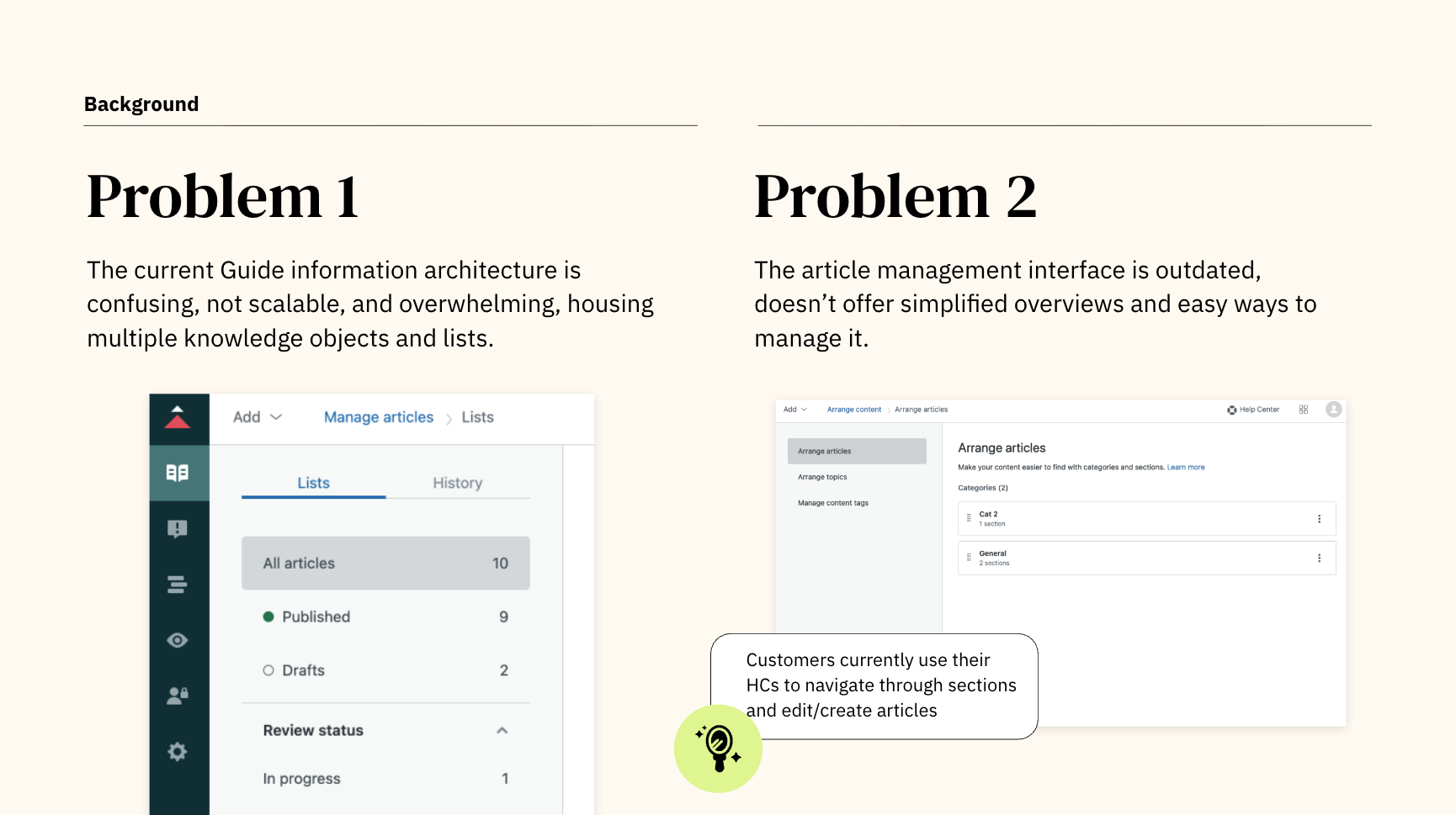
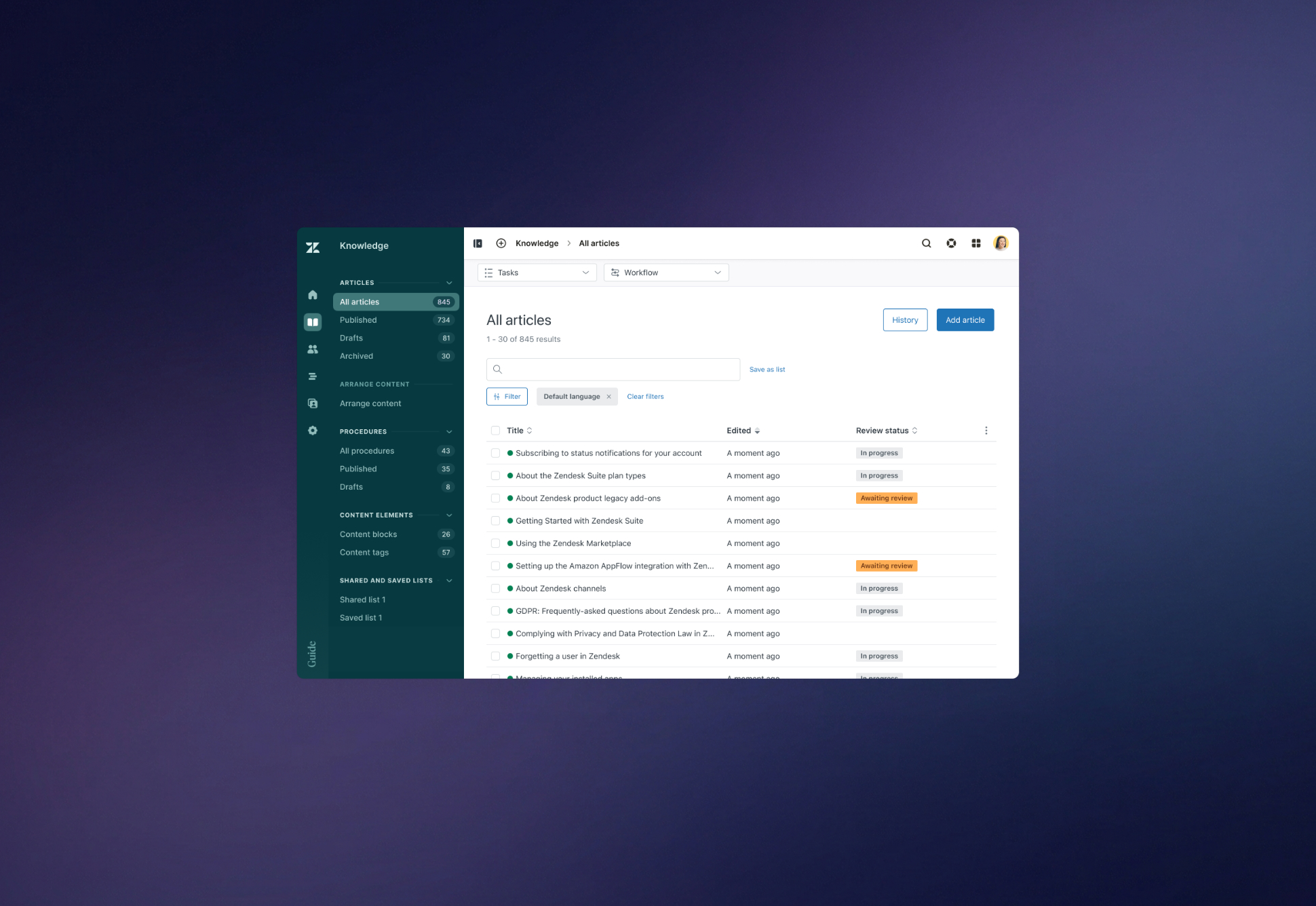
Zendesk Knowledge (previously Guide) is widely used by enterprises to organize and distribute knowledge across brands, languages, and teams. However, as organizations scaled, admins increasingly struggled to manage complex content structures. Rearranging help centers, maintaining taxonomy, and keeping knowledge aligned with business changes became slow, manual, and fragmented tasks spread across multiple tools.
When I joined Knowledge, the team had awareness of the pain, but lacked clarity on the underlying architectural gaps. My focus was to lead a comprehensive discovery and definition effort to understand the problem, benchmark opportunities, and shape a scalable direction for knowledge management in Zendesk.
Understanding the problem
Despite being a core product, Knowledge lacked the infrastructure admins needed to operate knowledge at scale. Several input channels consistently surfaced the same patterns:
Admins could not:
• Visualize their content architecture end-to-end
• Reorganize structures efficiently
• Maintain governance across brands and languages
• Edit content in context
This forced them into workarounds such as rebuilding sitemaps in Miro, tracking content in spreadsheets, or performing heavy manual work article by article.
In short: Knowledge made knowledge production possible, but not scalable.
Research & insights
To understand the problem space holistically, I combined multiple methods:
• 1:1 interviews with enterprise admins and knowledge leaders
• Competitor benchmarking
• Analysis of UserVoice requests and CS tickets
• Workshop facilitation with Product, Engineering, and Content Strategy
• Internal product tours and heuristic evaluation
This revealed three core insights: 1. Visibility is missing
Admins lacked an overview of their help center “tree,” making governance and restructuring nearly impossible without external tools.
2. Reorganization is inefficient
Moving articles or sections required deep navigation, many clicks, and no bulk operations.
3. Governance does not scale
Multi-brand, multi-language setups created exponentially more complexity without tooling to support it.
Benchmarking also showed that competitors (Intercom, Front, Document360, etc.) were ahead in visual hierarchy, drag-and-drop, and contextual editing, positioning this as not only a UX gap, but a strategic one.
Strategy direction
Based on insights, I defined a strategic concept we called Scalable Knowledge Architecture, a direction for how Knowledge should be structured, visualized, and managed inside Zendesk moving forward.
It introduced three major design principles:
1. Hierarchical Visibility
Admins must understand their entire knowledge architecture at once — not one layer at a time.
2. Contextual Operations
Editing and reorganizing content should happen inside the same view, without losing the structural context.
3. Scalable Governance
Actions that affect multiple brands, languages, and content objects should be supported through bulk operations and structured metadata.
To communicate the direction effectively, I produced a definition package including research synthesis, IA diagrams, interaction concepts, and product recommendations, which became a foundation for subsequent roadmap discussions.
Design definition
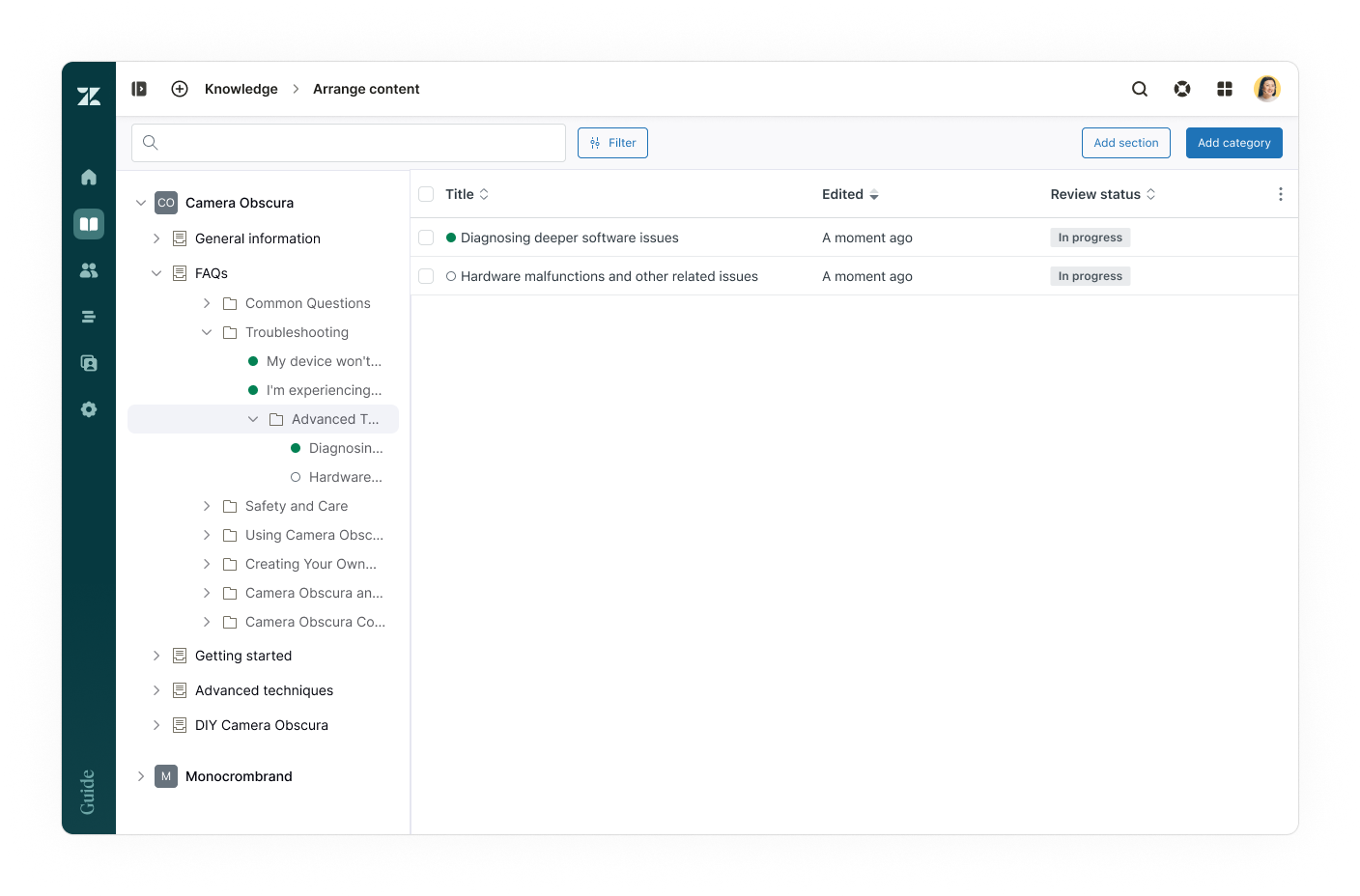
This concept materialized into three key experience spaces:
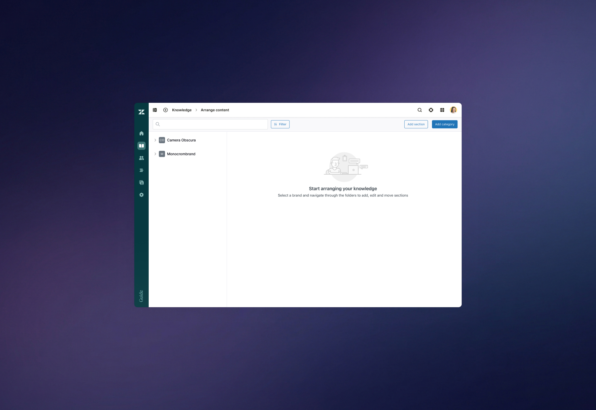
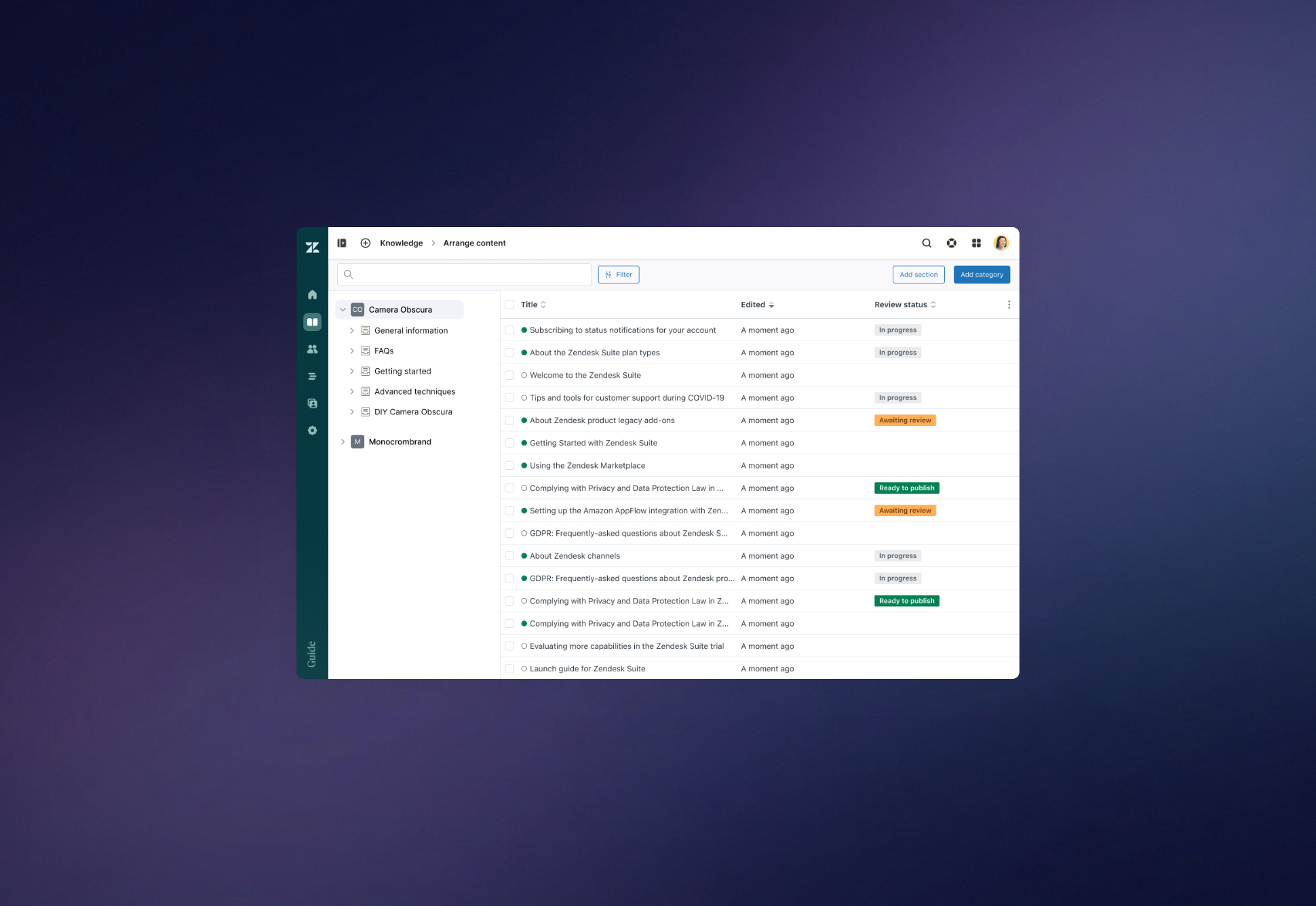
• Directory View: a sitemap-like interface enabling admins to visualize and manipulate the hierarchy across brands and languages.
• Contextual Editing: opening and editing articles directly within the hierarchy, preserving orientation and flow.
• Bulk Management (Stretch): performing multi-item operations such as moving, publishing, assigning, or archiving at scale.
These artifacts shifted the team’s mindset from “editing articles” to managing knowledge systems.
Outcomes & impact
The artifacts directly informed future Knowledge Admin experience work and Knowledge Management strategy discussions
Teams continue to reference the materials when working on navigation, hierarchy, or content tooling
Highlighted intersections with AI Assistant, Article Insights, and multi-brand workflows, expanding the value beyond Knowledge
Key learnings
This project reinforced several dimensions of design practice:
• Architecture matters as much as UI: visibility and structure drive adoption and efficiency.
• Enterprise needs shift over time: as orgs scale, knowledge becomes operational, not editorial.
• Strategy emerges from constraints: technical limitations and customer pains together shaped the direction.
• Influence > ownership: the most meaningful output here was alignment, not screens.