UX research using previous materials and competitor analysis
Customer journey mapping
Wireframing and user testing
UI design based on Material Design for Android
Year
2018
About this projects
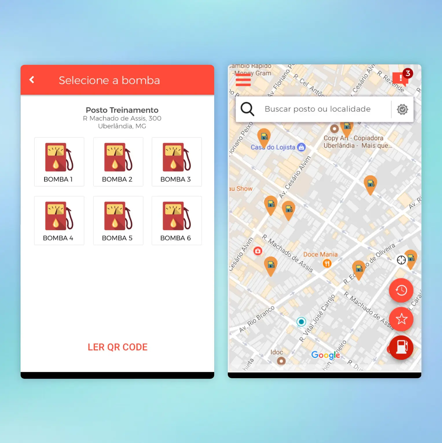
A mobile app that simplifies refuelling with in-app payments and discounts
Fuel ’n’ Go was an internal initiative that had lived on paper for years due to lack of time, team, and budget. Once the company decided to move forward, I was responsible for designing the entire experience and defining how the product should work. The core objective was to let users easily locate nearby gas stations, pay through the app, access offers and discounts, and simplify the refuelling process for both customers and employees.
Understanding the problem
For this project, we leveraged existing research from previous initiatives, including personas, interviews, and user feedback, and expanded it with competitor analysis to understand market standards and opportunities. Before moving into wireframes, we identified the need to map the customer journey to get clarity on interactions, pain points, and critical touchpoints that required special attention.
Main activities:
• Used previous personas and interview data
• Conducted competitor research
• Identified the need for a customer journey to guide decisions
• Prepared the foundation for wireframes and testing
Mapping the experience
The customer journey helped us visualize how users would navigate the app and where the most sensitive moments were, such as registration, payment, and station selection. Mapping the steps made it easier to predict issues early and brainstorm solutions, ensuring a smoother and more intuitive experience from the very first interaction.
Main activities:
• Mapped the end-to-end journey
• Identified friction points and high-risk steps
• Brainstormed improvements based on user behavior
• Used insights to guide wireframes and UI decisions
UI Design
The final UI followed Material Design principles for Android, using a light theme combined with the brand’s bold orange for emphasis. Icons supported quick comprehension, and visual feedback was prioritized throughout the flow to give users confidence during actions such as payment and registration. The interface was designed in Photoshop and prototyped using Marvel for validation.
Main activities:
• Created a Material Design–based light interface
• Used the brand’s orange for highlight and hierarchy
• Prioritized clarity, visual feedback, and accessible flows
• Delivered prototypes to support user testing and iteration
Outcomes & impact
2K+
downloads, confirming market relevance and successful onboarding for first-time users
30+
pieces of positive user feedback, reinforcing clarity, ease of use, and confidence in core user journeys
66+
production-ready screens, aligning flows, states, and edge cases into a consistent and scalable UX.
Key learnings
This project was a significant challenge, especially due to the complexity of the registration flow, which was the user’s very first interaction with the product. Designing such a long and sensitive process in a way that felt smooth and pleasant required extensive research, brainstorming, and testing. Bringing a project that had been only an idea for years to life was incredibly rewarding.