Collaborate closely with developers to ensure feasibility
Year
2017
About this projects
Eldoc was the first major project I tackled during my initial year as a UX/UI Designer, and one of the most complex
Originally created in the early 2000s (before design processes were widely adopted), Eldoc was a legacy product built entirely by developers. It served large B2B clients within the B2W group (Americanas, Submarino and Shoptime), enabling them to manage fiscal documents and generate operational and compliance reports.
However, the interface had not evolved with the industry. The product suffered from significant usability issues, visual inconsistency and a learning curve that slowed down daily operations.
My role was to deeply understand this legacy ecosystem, uncover usability gaps and redesign the experience from the ground up.
Understanding the problem
To form a complete picture of the product’s challenges, I conducted interviews with daily users and reviewed existing customer feedback. These conversations revealed critical pain points:
• Users struggled to locate key functionalities within an outdated IA
• Essential tasks required too many steps or unnecessary clicks
• Inconsistent patterns increased cognitive load
• The UI lacked visual hierarchy, making navigation slow and error-prone
A structured heuristic evaluation validated these issues, highlighting violations in consistency, feedback, error prevention and learnability.
Mapping the experience
Given the complexity of Eldoc, mapping each user flow was essential. By visualising every possible path, from document creation to reporting, I identified:
• Redundant steps that could be merged
• Opportunities to reduce friction
• Non-intuitive decision points
• Missing shortcuts or automation opportunities
These insights guided the redesign toward a more efficient and predictable experience.
Sketching & early prototyping
Because the product needed a full redesign, I began with low-fidelity sketches. This allowed quick iteration and alignment with stakeholders before investing time in high-fidelity UI.
The chosen concept introduced:
• A collapsible left-side navigation for clear structure
• A top bar with essential shortcuts
• A persistent search bar, given how frequently users needed to locate documents
• A clean main content area prioritising readability and task completion
These initial sketches served as the foundation for usability discussions and UI decisions.
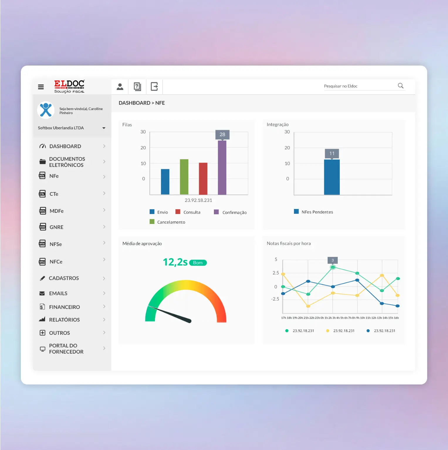
UI Design
With the structure defined, I moved into high-fidelity UI design using Material Design as the base system. The visual direction adopted:
• A light and neutral colour palette for clarity
• Clear typographic hierarchy
• Consistent spacing and component patterns
• Desktop-optimised layouts for heavy operational workflows
Although time constraints limited our ability to test with external users, I ran usability walkthroughs with internal stakeholders. Feedback was highly positive, teams felt the redesign brought freshness, clarity and significant usability improvements to a long-standing tool.
Key learnings
This project shaped the foundation of how I work today. I learned how to:
• Conduct end-to-end UX processes for complex, legacy B2B systems
• Facilitate user interviews and make clients feel comfortable sharing context and frustrations
• Translate deeply technical requirements into intuitive flows
• Prototype and validate design decisions under tight constraints
• Collaborate with developers effectively, leveraging my 10 years of previous experience in development
Eldoc taught me how to balance modern UX principles with the realities of legacy infrastructure, a skill that continues to influence my work in product design.