UX research using analytics, heatmaps and user feedback
Benchmarking and competitor analysis
Sketching and low fidelity proposed improvements
Collaboration with development team to implement updates
Light UI adjustments to improve clarity and usability
Year
2018
About this projects
A mobile-focused usability upgrade that removed friction, simplified flows, and enabled customers to complete purchases smoothly on smaller screens.
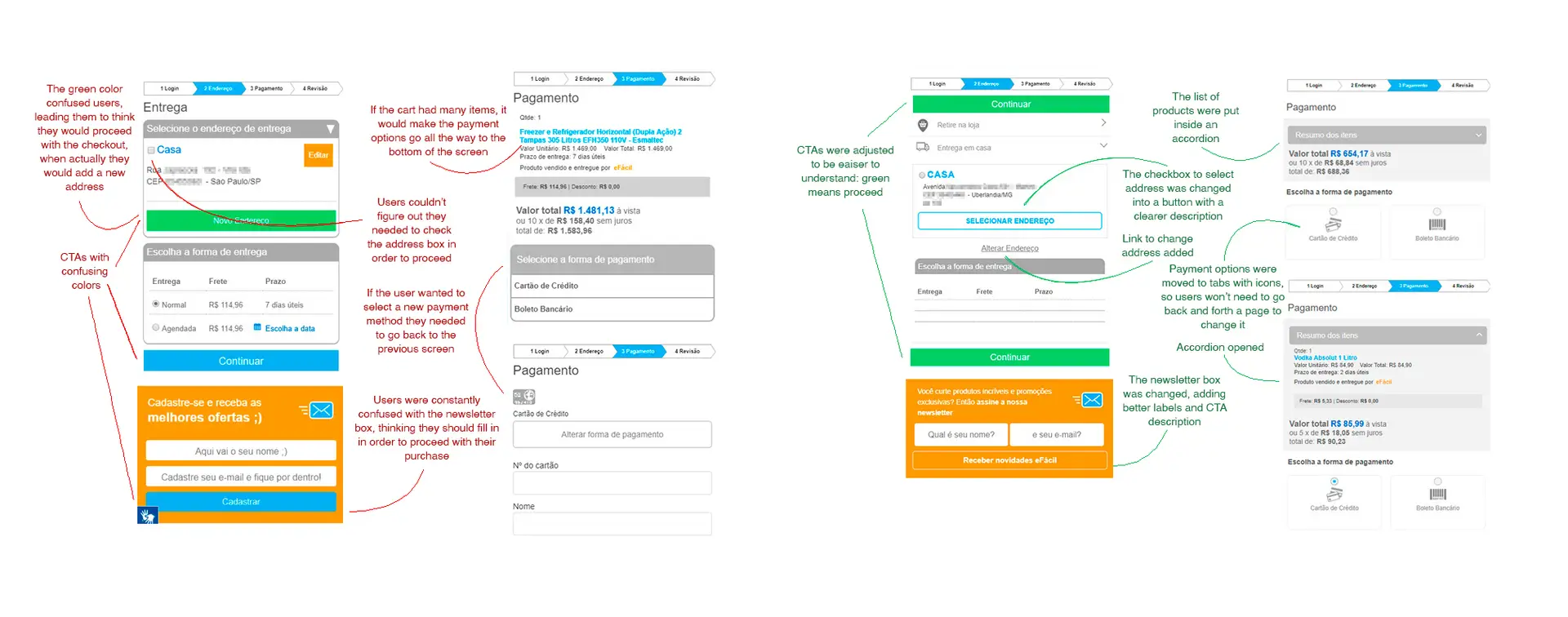
eFácil is a long-standing B2C e-commerce platform with over 20 years, whose checkout experience was not designed for mobile use. As mobile traffic grew, users increasingly struggled to complete purchases on their phones, resulting in low conversion rates.
This project focused on identifying usability issues in the existing checkout flow and applying targeted improvements to enable successful mobile purchases, without a full visual redesign.
Understanding the problem
The work started with a deep analysis of quantitative and qualitative data. Google Analytics and Hotjar recordings were used to understand where users dropped off and how they interacted with the checkout flow. These insights were complemented by existing user feedback and competitor analysis to identify best practices.
Early ideas were explored through sketches to validate layout changes before moving into final adjustments.
Main activities
• Analysis of GA data and Hotjar recordings
• Review of user feedback and support tickets
• Competitor benchmarking
• Low-fidelity sketches to test hierarchy and element placement
• Final usability-focused UI adjustments
UI Design
Rather than redesigning the interface, the focus was on removing friction and improving comprehension throughout the checkout journey.
Improvements included clearer hierarchy, better spacing, more visible actions and subtle visual cues to guide users forward.
What changed
• Improved layout and content hierarchy
• Clearer button styles and interaction feedback
• Better spacing and alignment for readability
• Added icons to reinforce meaning and reduce cognitive load
Outcomes & impact
+167%
increase in mobile purchases
Key learnings
This project reinforced how impactful usability work can be, even without major visual changes. Working within technical constraints and a small team required close collaboration with engineering and constant prioritization.
Seeing clear, measurable results helped solidify my approach to designing with both user needs and implementation realities in mind.