This project evolved significantly over its lifespan. In the early stages, I worked as a Product Designer, directly designing solutions and interfaces. As the scope expanded, I transitioned into a UX Lead and Product Owner role, focusing on research, strategy, prioritization, and team enablement.
UX leadership and research strategy
End-to-end user research including interviews, surveys, testing, and experiments
Definition and prioritization of the UX roadmap
Stakeholder alignment and backlog organization
Mentoring and guiding other designers
Acting as Product Owner for UX initiatives
Leading DesignOps and design system efforts
Year
2020/2022
About this projects
Rebuilding trust and usability in a large-scale agriculture platform
AgroBayer Brasil is the Brazilian agriculture portal of Bayer, designed to be a central learning hub for rural producers. The platform hosts articles, videos, live streams, products, and educational content aimed at supporting farmers in their daily decision-making.
After a major redesign conducted by an external agency, the new portal launched with significant usability issues. Core functionalities were broken, navigation was confusing, and the experience lacked any research-backed foundation. Instead of becoming a reference in agricultural content, the platform caused frustration, disengagement, and loss of trust among users.
I joined the project to lead a long-term UX effort focused on fixing usability issues, rebuilding the experience based on user needs, and supporting the product’s evolution over time.
Shifting from assumptions to evidence-based decisions
The first priority was to stop guessing and start understanding. The redesigned portal lacked any user research, personas, or usability validation. We reframed the work as an ongoing improvement program rather than a single redesign.
Together with stakeholders, we mapped all platform pages and features, identified the most critical usability failures, and defined a roadmap structured in iterative sprints. Early focus areas included navigation, search, content discovery, and broken interaction patterns.
This approach allowed us to stabilize the experience while progressively improving it based on real user input.
Research & discovery
Building deep understanding of rural producers
Research became the foundation of every decision. We combined multiple qualitative and quantitative methods depending on the problem being addressed.
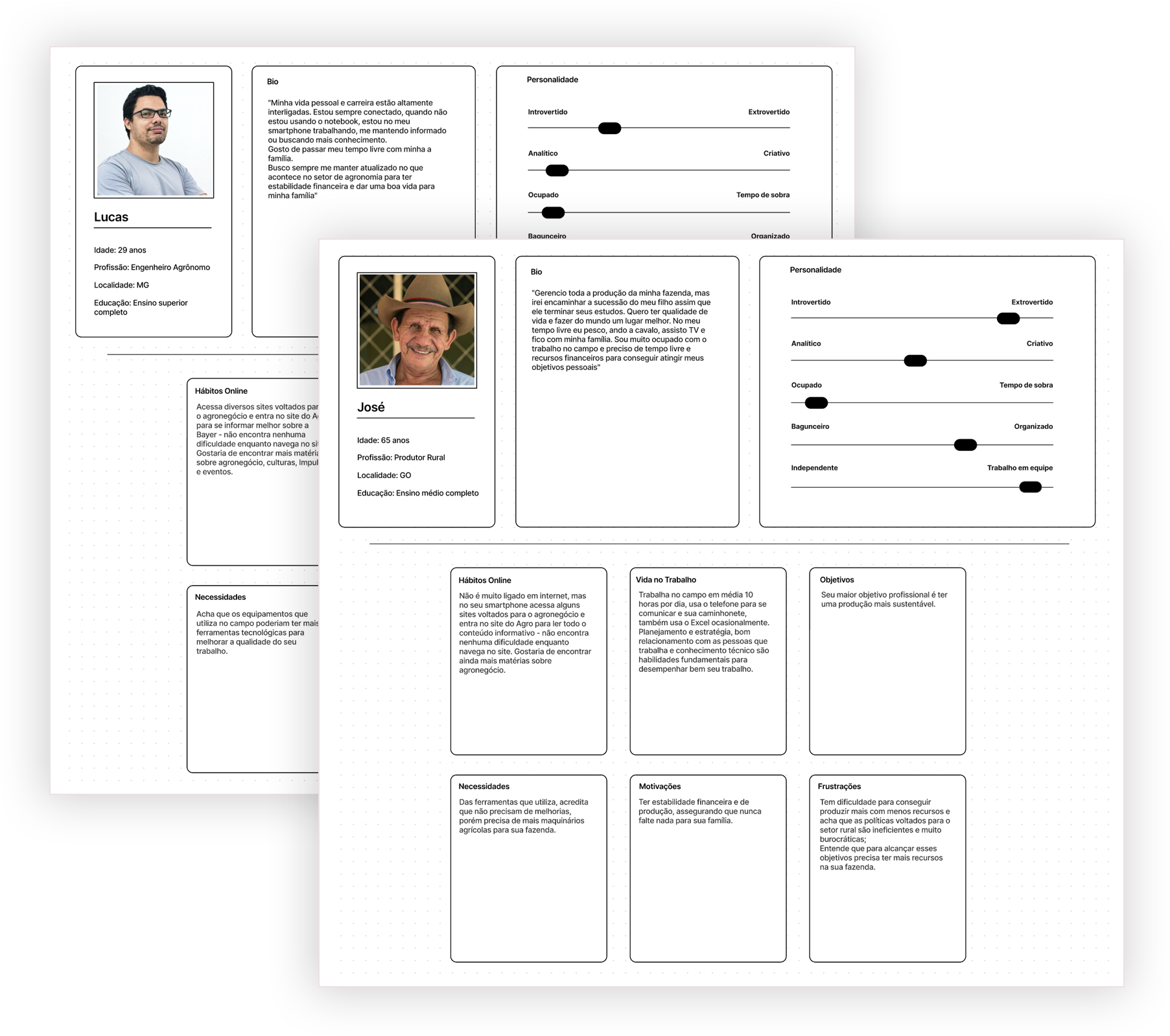
Personas
We identified a lack of clarity around who the platform was truly serving. Through surveys and interviews, we gathered behavioral and contextual data and created two core personas. These personas guided prioritization, content strategy, and interaction decisions across the platform.
Surveys
Short, contextual surveys were deployed throughout the portal to capture user expectations, frustrations, and needs. This approach generated a high volume of actionable feedback and helped validate assumptions quickly.
Interviews
Moderated interviews allowed us to deeply understand users’ routines, constraints, and motivations. These conversations were critical to building empathy within the team and aligning stakeholders around real user problems rather than internal opinions.
User testing
Remote moderated usability tests were conducted to validate proposed solutions. These sessions revealed friction points that analytics alone could not uncover and helped refine designs before release.
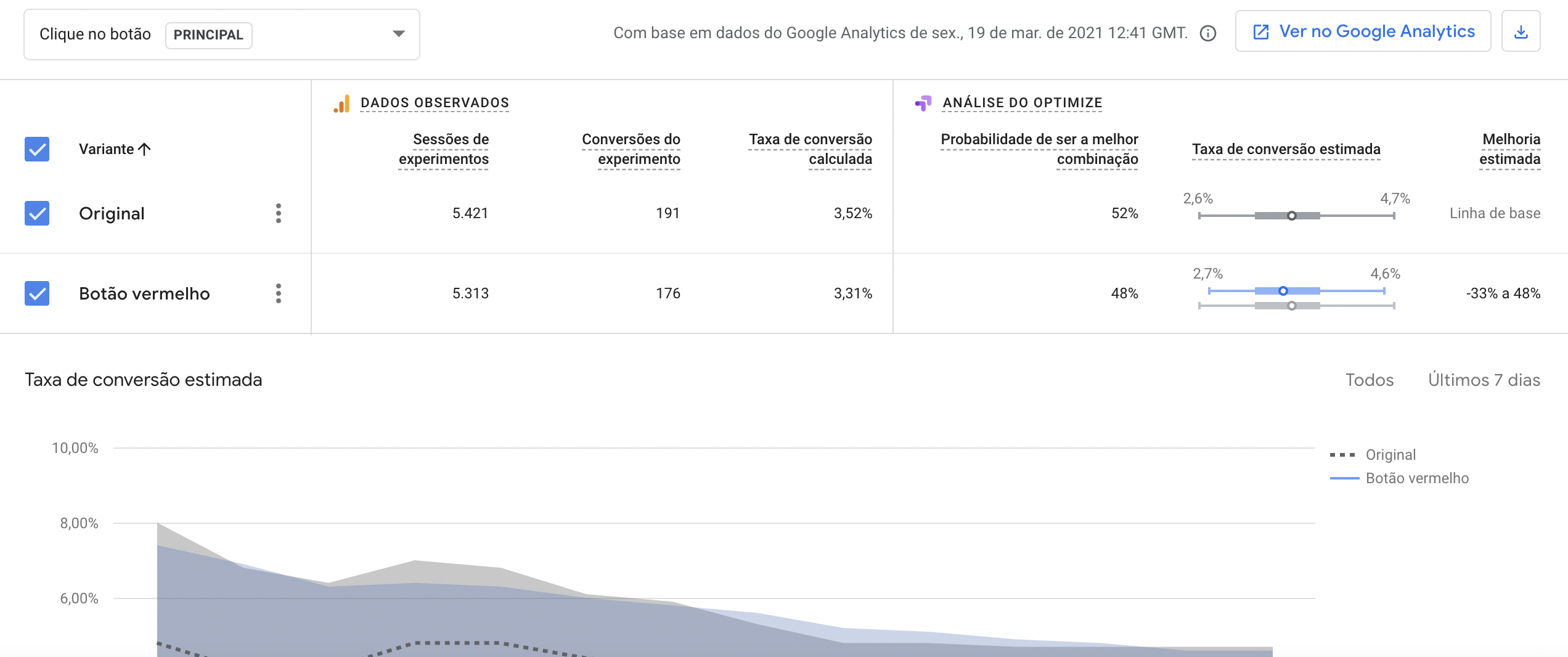
Experimentation
Testing hypotheses before committing
A/B testing played a key role in validating design decisions. Experiments focused on improving engagement and discoverability by testing variations of CTAs, copy, layout, and visual emphasis.
These experiments allowed us to make incremental improvements with confidence and demonstrate the impact of UX decisions through data.
Design execution
Designing clarity into a complex content ecosystem
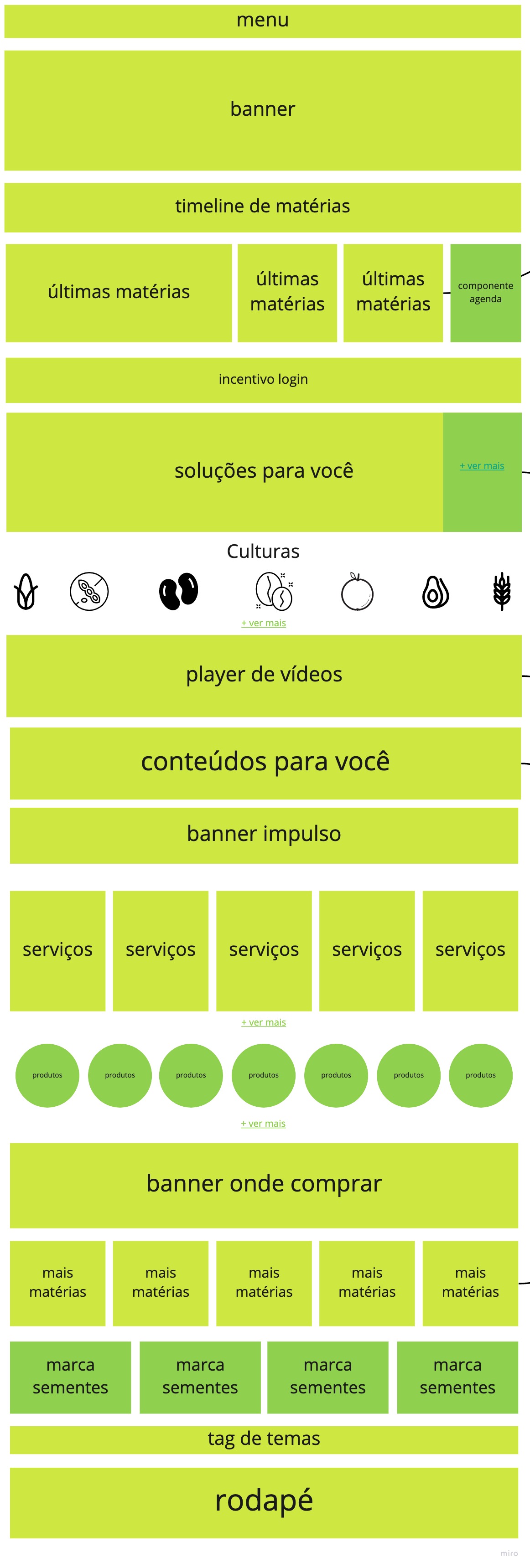
Wireframes were used extensively to align teams before UI work began. Low-fidelity wireframes helped validate structure, hierarchy, and flows with stakeholders and reduced rework downstream.
As the project evolved, UI execution was handled collaboratively, with another designer focusing on visual delivery while I ensured UX consistency, usability, and alignment with research insights.
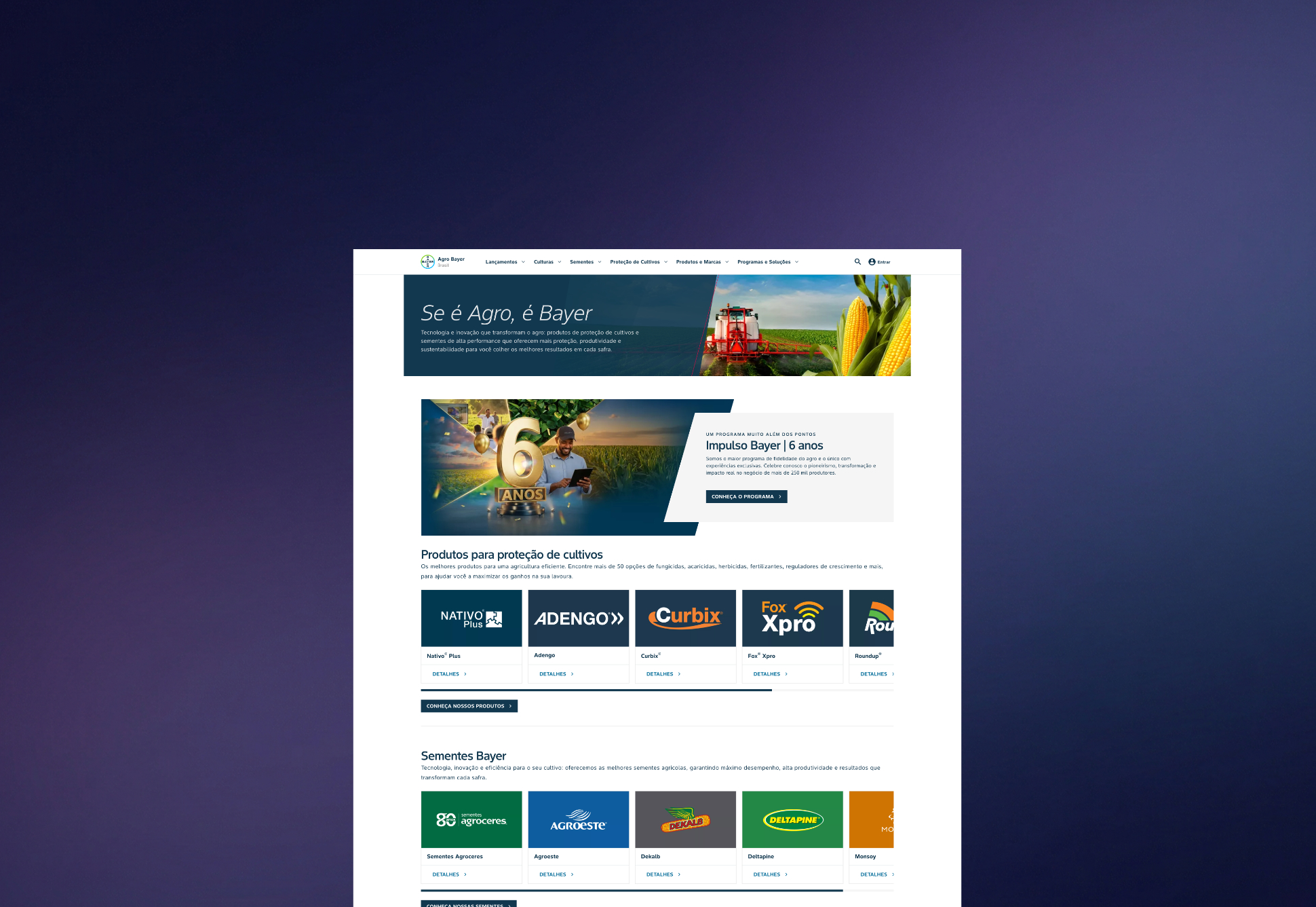
The homepage and key content templates were progressively refined to support scanning, comprehension, and discovery, while respecting the constraints of a large content-driven platform.
DesignOps
Creating order in a decentralized ecosystem
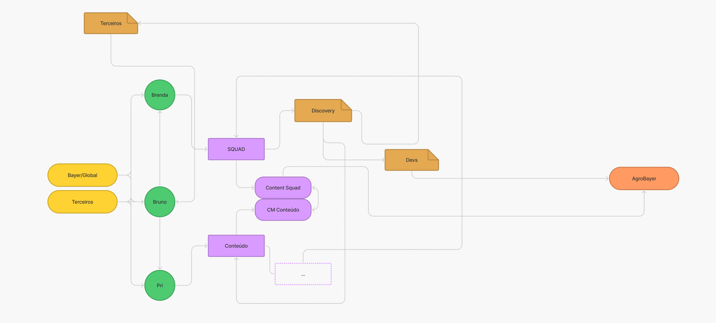
One of the biggest challenges was operational. Multiple agencies and teams were publishing content without design review, resulting in inconsistencies and broken experiences.
To address this, I led the definition of DesignOps processes that established:
• Clear workflows for content and page creation
• Design review checkpoints
• Ownership and responsibilities across teams
• Shared guidelines for consistency
This significantly reduced fragmentation and improved collaboration between design, content, and engineering.
Design system
Enabling scale and consistency
One of the biggest challenges was operational. Multiple agencies and teams were publishing content without design review, resulting in inconsistencies and broken experiences.
To address this, I led the definition of DesignOps processes that established:
• Clear workflows for content and page creation
• Design review checkpoints
• Ownership and responsibilities across teams
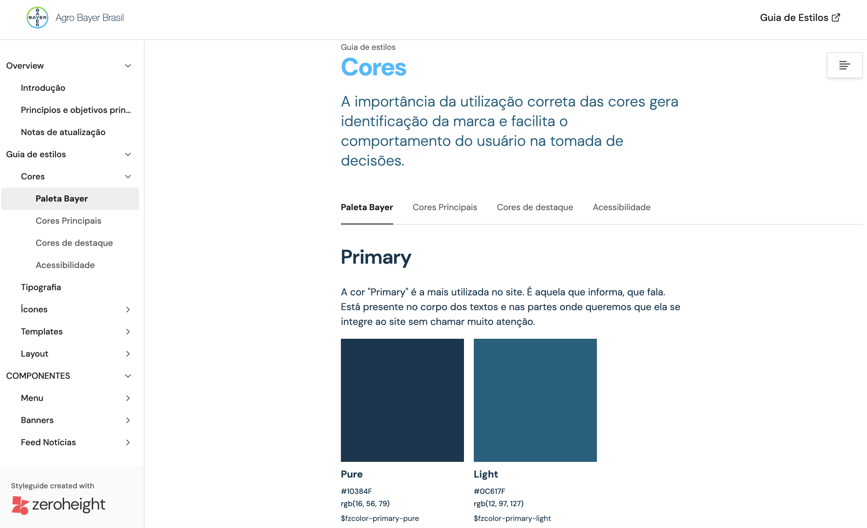
To support long-term scalability, we built a design system that documented components, patterns, and guidelines for the portal. The system served as a shared reference point for designers, developers, and external partners.
It helped standardize UI decisions, reduce inconsistencies, and improve communication between design and engineering.
The DS created can be viewed on zeroheight.
Outcomes & impact
78%
positive user ratings, reflecting improved satisfaction and trust
Clear reduction in usability complaints across critical flows
Stronger alignment between user needs, content strategy, and platform structure
Improved collaboration and efficiency across teams
Key learnings
This project reinforced that meaningful UX improvements often happen over time, not through a single redesign. Leading UX in a complex ecosystem required patience, prioritization, and constant advocacy for users.
It was also a defining experience in developing my leadership skills. Acting as UX lead and product owner taught me how to balance research depth, delivery pressure, and stakeholder expectations while keeping the user at the center.
Working in an unfamiliar domain like agriculture pushed me to learn quickly, listen deeply, and design with humility. Seeing the platform evolve into a more usable and trusted tool for thousands of users made the challenges worth it.